Best Way to Color Match Paint: Perfecting Your Palette
To best match paint color, start by identifying the exact hue using a reliable color wheel or digital tool. Avoid warm or cool biases. Collect a clean, quarter-sized sample from an inconspicuous spot for accurate store scanning.
When mixing, adjust paint value by adding white and tone brightness using complementary colors rather than black. Remember, paint dries differently by type, so test swatches after drying under consistent light.
Following these steps guarantees precision and consistency. Discover how to refine your match even further.
Key Takeaways
- Collect a clean, quarter-sized physical paint sample from an inconspicuous spot for accurate store matching.
- Use spectrophotometers or advanced color-matching tools under consistent lighting for precise hue identification.
- Identify the exact hue on a reliable color wheel before adjusting saturation and value separately.
- Test small paint mixes with incremental adjustments using white or complementary colors to refine value and brightness.
- Allow test swatches to dry fully and evaluate under consistent lighting to confirm final color accuracy before full application.
How To Identify The Exact Paint Hue For Matching?

Start by identifying the exact hue on the color wheel to establish a precise starting point for your paint matching process.
Focus on the pure color family: red, blue, yellow, or their intermediates, without confusing warm or cool variants.
This clarity helps you avoid mixing errors later on. Use a reliable color wheel or digital tool to pinpoint the hue accurately.
Once you lock the hue, observe its saturation and value separately.
Saturation measures color intensity, while value refers to lightness or darkness.
Avoid guessing these attributes visually; instead, compare your sample under consistent lighting.
This methodical approach guarantees you start with a precise foundation before adjusting brightness or tint.
Accurate hue identification minimizes trial and error, saving time and materials in your paint matching project.
For best results, select paints labeled safe for vinyl/plastics with UV protection to ensure durability and color retention.
Mixing Primary Colors For Accurate Paint Hue
Mixing primary colors with care guarantees you achieve an accurate base hue for your paint match. Start by combining equal parts of red, blue, and yellow, avoiding cool or warm variants to maintain neutrality.
Adjust ratios incrementally, always testing small batches to refine the hue. Keep track of your mixes for consistency and future reference.
| Primary Color | Purpose |
|---|---|
| Red | Adds warmth |
| Blue | Introduces coolness |
| Yellow | Brings brightness |
| Equal Mix | Forms base hues |
| Adjust Ratio | Refines hue |
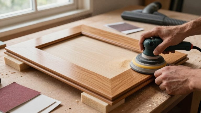
Choosing the right finish is essential, as painted cabinets create an opaque, smooth layer that allows vibrant colors to stand out without distraction.
Adjusting Paint Value For Accurate Color Matching
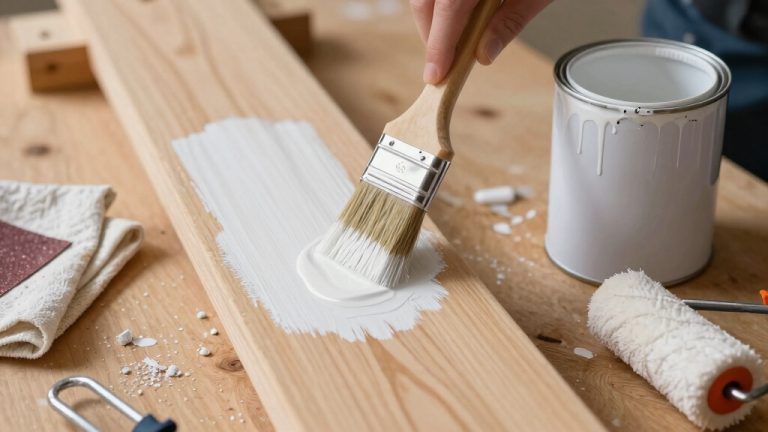
To fine-tune your paint’s value, begin by adding a bit of white. This will lighten the hue without changing its core color.
If you find that the brightness still feels off, try introducing a small amount of the complementary color. For instance, if you’re working with red, a little green can help, or if you’re using yellow, a touch of purple might do the trick. This can really help reduce intensity and bring everything into balance.
And hey, don’t forget to test your adjusted mix once it dries! It’s super important to make sure the value matches perfectly. You want your colors to sing together, right?
For the best results, ensure your surface is properly prepared, as surface preparation enhances the effectiveness of any color treatment.
Using White To Adjust
A vital step in adjusting paint color involves adding white to modify its value without altering the hue. When you add white, you lighten the paint, making it easier to match the brightness of your target color.
Start with small increments to avoid overshooting the desired value. Keep in mind that different paint types dry differently; some, like tempera or gouache, lighten noticeably as they dry.
So, mix slightly darker initially. Always test swatches after drying to verify accuracy. Adding white doesn’t change the chromatic tone, so your hue stays consistent while you refine lightness.
This approach guarantees you maintain the true color character while adjusting for value, a key factor in achieving a seamless and professional color match.
For best results, consider the drying and curing times of your paint to ensure the final color is accurately represented after it fully sets.
Complementary Colors For Brightness
Although adding white adjusts paint value by lightening it, you can fine-tune brightness more effectively by incorporating complementary colors.
Complementary pairs like red/green, blue/orange, and yellow/purple help reduce brightness without shifting the hue dramatically.
When a paint appears too bright, adding a small amount of its complement darkens it subtly, maintaining color integrity.
This method works better than just adding black or gray, which can dull the color.
Always test swatches after drying since paints can change slightly in value.
Adjust in small increments to avoid overshooting the target brightness.
Using complementary colors gives you precise control over value, ensuring your matched paint looks accurate and vibrant.
This approach is especially useful when white alone makes the color appear washed out or flat.
For optimal results, ensure that any painting is done after the floors are fully dried to prevent damage and achieve a cohesive finish, as emphasized in best practices.
Using Complementary Colors To Adjust Paint Brightness
You know, one great trick for adjusting paint brightness is to use complementary colors—like red and green or blue and orange. It’s pretty effective!
By adding just a little bit of the complement, you can really dial down the paint’s brightness without changing the hue at all.
It’s all about finding that sweet spot. Just be careful with your mixing; a little goes a long way. Once you’ve mixed it up, make sure to test some dried swatches. That way, you can see if the brightness adjustment is just right for what you’re aiming for!
Keep in mind that environmental factors like humidity levels can affect how your paint dries and how the colors ultimately look once fully cured.
Complementary Color Basics
Complementary colors play an essential role in adjusting paint brightness by neutralizing intensity and balancing hues.
When you mix a color with its complement, such as red with green or blue with orange, you reduce the brightness without drastically changing the hue.
This technique helps you control the vibrancy, making the color less overpowering and more visually balanced.
To use this effectively, start by identifying the hue on the color wheel and then add small amounts of its complement to your paint mix.
Be cautious, as too much complement can dull the color excessively.
Always test your mixture with dry swatches since paint often looks different once dry.
This method lets you adjust brightness smartly while maintaining color integrity.
In interior design, it is also important to consider undertones in paint and flooring to achieve harmony and visual balance in a space.
Brightness Reduction Techniques
When you want to tone down a paint’s brightness without altering its core hue, using complementary colors offers an effective solution. By adding small amounts of the color opposite on the wheel, you reduce vibrancy while keeping the original shade intact. This technique balances intensity and prevents the color from becoming dull or muddy.
Keep these tips in mind:
- Add complementary colors gradually to avoid over-darkening or shifting hue.
- Use red/green, blue/orange, or yellow/purple pairs based on your base color.
- Test small swatches and allow them to dry before finalizing adjustments.
This method helps you achieve a more muted, natural look without compromising the base color’s identity. It ensures your paint matches your vision precisely. Additionally, controlling the application with thin coats and removal of excess can help manage the final color intensity effectively.
Practical Mixing Tips
Toning down paint brightness by adding its complement works best with careful, incremental mixing.
Start with small amounts of the complementary color: red with green, blue with orange, or yellow with purple. Too much can quickly dull your hue.
Mix thoroughly after each addition and test a swatch, allowing it to dry fully before evaluating.
Remember, paint often changes slightly when dry, so adjust accordingly. Use a neutral base paint to avoid unintentionally shifting the hue.
White can help modify value without affecting brightness as drastically. Always document your ratios to replicate or tweak the mix later.
This method gives you precise control over brightness while preserving the original color’s integrity.
It ensures your final paint matches your vision accurately.
For best results, consider environmental factors such as humidity and temperature when mixing and applying paint to ensure consistent drying and color retention.
How To Collect Paint Samples That Match Perfectly?
Although it might seem easier to snap a quick photo, collecting a physical paint sample guarantees the most accurate color match. To ensure precision, you need a clean, intact sample that reflects the paint’s true color after drying.
Here’s how to collect it properly:
- Cut a quarter-sized piece from an inconspicuous wall spot using a craft knife, or remove a sample from behind a switch plate or vent cover.
- Make sure the sample is large enough—about a quarter-inch or more—to allow scanners to read it accurately.
- After sampling, patch the area with spackling, sand smooth, and repaint to maintain your wall’s finish.
When refinishing floors near walls, taking care to avoid damage to baseboards and walls ensures the surrounding surfaces remain pristine.
Why Phone Photos Fail In Paint Matching?
You really can’t count on phone photos for paint matching. It’s all about the lighting—how it can totally change the way colors show up on your screen. Cameras just don’t capture hues with the same accuracy as the human eye, so what you see in a photo mightn’t be the true shade you’re looking at in person.
That’s why it’s always better to go with physical samples. They give you the precise reference you need to nail that perfect match. Trust me, it makes a world of difference!
Lighting Variability Issues
When lighting conditions vary, phone photos often fail to capture paint colors accurately, leading to mismatches. Your phone’s camera adjusts automatically to different light sources, which changes how colors appear.
Indoor incandescent, fluorescent, and natural daylight each cast different hues, distorting the true paint color in photos. This variability makes relying on phone images risky for precise matching.
Consider these lighting challenges: shadows and reflections shift color perception. Warm or cool light alters paint’s apparent tone. Inconsistent light sources between sample and room cause discrepancies.
To avoid these pitfalls, always bring a physical sample to the paint store or use professional tools designed to compensate for lighting variability. This ensures your match reflects the true color under your room’s actual conditions.
Color Accuracy Limitations
Lighting inconsistencies don’t just affect how colors appear in photos. They also expose the fundamental flaws of relying on phone images for paint matching.
Your phone’s camera can’t capture true color values accurately because sensors and software interpret hues differently under varying light conditions. White balance shifts, shadows, and reflections distort the original shade, making the photo unreliable for precise matching.
Additionally, screen displays vary widely, so what you see on your phone might differ from the actual paint color. Professional scanners use controlled lighting and calibrated sensors to analyze physical samples, eliminating these inaccuracies.
To guarantee exact color matching, you need a physical sample that professionals can test directly. Phone photos simply can’t deliver the level of precision required for flawless paint matching.
What Happens At The Paint Store: Pro Matching Explained?
Bring your physical paint sample to the store for professional matching. Trained staff use advanced scanners and extensive color libraries to identify the closest formula. They start by selecting the appropriate base paint, then add precise tints before shaking the can thoroughly.
After mixing, they verify the match against your sample to guarantee accuracy. At the store, you can expect:
- Use of spectrophotometers to analyze your sample’s color profile.
- Access to competitor formulas for discontinued or special shades.
- Physical comparison of the mixed paint with your original sample.
This process guarantees you get the best possible color match, tailored specifically to your needs without relying on phone photos or guesswork.
Best Technology Tools For Paint Color Matching
Although traditional methods remain reliable, advanced technology tools have transformed how you achieve accurate paint color matching.
Devices like ColorSnap® Match Pro use controlled lighting and smartphone integration to scan your sample precisely, minimizing human error.
Full-spectrum white LEDs combined with exclusive algorithms deliver exact color readings.
Apps such as Benjamin Moore’s Color Portfolio let you scan surfaces directly, matching colors to extensive brand-specific libraries.
In-store spectrophotometers read your physical samples and generate exact formulas, guaranteeing consistency.
These tools outperform manual matching, especially for discontinued or complex hues.
To get the best results, always provide a physical sample of adequate size and avoid relying on photos.
Leveraging these technologies saves you time, reduces guesswork, and guarantees your paint matches perfectly every time.
How Paint Types Affect Drying And Color Matching?
Because different paint types dry at varying rates and with distinct finishes, understanding their behavior is essential for accurate color matching.
You’ll notice some paints lighten or darken as they dry, affecting the final hue you see. To match colors perfectly, consider these key points:
Tempera and gouache dry lighter than when wet, so mix these slightly darker.
Acrylic and oil paints generally maintain color consistency from wet to dry.
Always test swatches after drying since finishes and drying times influence the perceived color.
Troubleshooting And Tips For The Closest Paint Match
When you’re aiming for the closest paint match, it’s crucial to carefully assess your sample under consistent lighting and test multiple swatches after drying.
Always cut a quarter-sized sample from an inconspicuous area to guarantee accuracy. Remember, paint dries differently; acrylics hold color better than tempera, which lightens when dry. Mix slightly darker to compensate.
Avoid relying on phone photos; physical samples yield the best results. If your first mix falls short, tweak by adding complementary colors to reduce brightness or adjust value with white.
Use professional store scanners or apps like ColorSnap® Match Pro for precision, but verify matches by painting and drying swatches on site.
Finally, patch sampling areas neatly and repaint to maintain surface integrity. These steps make certain your paint blend is as close as possible.
Frequently Asked Questions
Can Paint Matching Be Done for Outdoor Surfaces and Materials?
Yes, you can match paint for outdoor surfaces and materials.
You’ll want to bring a physical sample from the exterior, like a chip or scrap, to the store or use a reliable scanner.
Outdoor paints have different finishes and durability, so make sure the match accounts for weather resistance.
Keep in mind, surface texture and aging can affect appearance, so test samples on the actual outdoor material before committing to large quantities.
How Does Lighting in a Room Affect Perceived Paint Color?
Lighting in a room acts like a spotlight, revealing or hiding your paint’s true colors.
You’ll notice warm incandescent bulbs make hues feel cozy and yellowish.
Cool fluorescent lights can wash colors out, making them appear pale or bluish.
Natural sunlight shifts color throughout the day, altering what you see.
To avoid surprises, test paint swatches under your room’s specific lighting at different times before committing fully.
Are There Eco-Friendly or Low-Voc Options in Matched Paint Formulas?
Yes, you can get eco-friendly or low-VOC options in matched paint formulas.
Many stores now offer bases with reduced volatile organic compounds that still accept custom tints.
When you bring your sample, ask for low-VOC or zero-VOC bases.
Professionals will mix the color while prioritizing environmental safety.
Just remember, some pigments may slightly affect VOC levels.
Can Old or Faded Paint Colors Be Accurately Matched?
Faded paint colors are like shadows of their former selves, but you can still match them accurately.
You’ll need a physical sample because scanners and spectrophotometers analyze the actual pigment, not the faded surface.
Bring a quarter-sized chip from an inconspicuous spot to a paint store or use advanced apps with controlled lighting.
Professionals can adjust formulas to compensate for fading, ensuring your new paint revives the original hue precisely.
What Is the Impact of Paint Finish on Color Perception?
Paint finish markedly impacts color perception by altering light reflection.
Glossy finishes reflect more light, making colors appear brighter and more vibrant.
Matte finishes absorb light, softening and muting hues.
When you choose a finish, expect subtle shifts in shade intensity.
To get an accurate match, test your paint in the intended finish and lighting conditions.
A color can look noticeably different between flat, satin, and gloss finishes.
From Mixing to Matching: Your Color Success Guide
To perfectly paint your project, prioritize precise paint picking by identifying hues, mixing masterfully, and matching meticulously.
Remember, adjusting value and brightness balances brilliance. Collecting clean samples guarantees seamless selection.
Trust technology tools and professional tips to tackle tricky tones. Understanding how paint type influences drying deepens your decisions.
By blending these brilliant basics, you’ll confidently create spellbinding colors that complement your space flawlessly every time.